Web
VisibleU

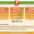
 I was the head of production at the small internet marketing firm VisibleU from 2008 to 2011, and I took the lead on every element of our graphic design work, both for our clients and internally. We went through several iterations of redesigning our company branding and our website in that time. Our goal with this design was to make our site as simple and direct as possible, while staying bright and friendly.
Go to website »NextPrevious
I was the head of production at the small internet marketing firm VisibleU from 2008 to 2011, and I took the lead on every element of our graphic design work, both for our clients and internally. We went through several iterations of redesigning our company branding and our website in that time. Our goal with this design was to make our site as simple and direct as possible, while staying bright and friendly.
Go to website »NextPrevious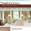
Chris Madden, Inc.


Chris Madden was a long-time client of ours at VisibleU, and I was very excited to work with them to completely rebuild their website from the ground up. The new site runs off of a WordPress base, with a custom theme I built from scratch. Our goal was to highlight Chris Madden’s personal style through photos, and also create a strong social media connection for her fans. The client was delighted with the result.
Go to website »NextPrevious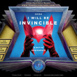
Soon I Will Be Invincible


 Soon I Will Be Invincible is a novel by Austin Grossman, published by Pantheon Books in 2007. It’s a novel of superheroes and supervillains, and the moral quandaries of a man driven to take over the world again and again. I designed a fully interactive flash site for the book’s release. The site included a secret sub-site with information on the characters and history in the world of the novel and a superhero quiz activity.
Go to website »
NextPrevious
Soon I Will Be Invincible is a novel by Austin Grossman, published by Pantheon Books in 2007. It’s a novel of superheroes and supervillains, and the moral quandaries of a man driven to take over the world again and again. I designed a fully interactive flash site for the book’s release. The site included a secret sub-site with information on the characters and history in the world of the novel and a superhero quiz activity.
Go to website »
NextPrevious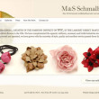
M&S Schmalberg


M&S Schmalberg have been making fabric flowers in the fashion district in the same way for over a century. It was an interesting challenge to create a digital presentation for their very handmade, beautiful work. I started off with a very large, close-up image of one of their pieces as the primary background element, and everything else flowed easily from there. The translucent silk background to the main content area adds a subtle and somewhat unusual touch to the site.
Go to website »NextPrevious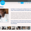
Transform Fitness


The founders of Transform Fitness had been working with VisibleU on their marketing for some time, so when it came to building a new site for them, we had some big ideas for what we wanted to do. We wanted to build a site that was simple and elegant but very powerful; something that was completely distinctive to reflect the very different kind of approach they had to personal fitness.
NextPrevious
LIREIA


The team from the Long Island Real Estate Investment Association came to us with some very specific requirements. They needed a site that wasn’t just a marketing tool, but was also a full members-only real estate marketplace, an event calendar, a dynamic members portal for investment tools and information, a blog and also contained an e-commerce feature by which they could sell tickets and memberships. We integrated a number of different software elements to get the job done, and put it all together in a seamless package that presents a simple frontend and an easily managed backend.
NextPrevious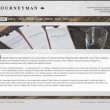
Journeyman


When my friends Diana Kudajarova and Tse Wei Lim announced that they were opening a restaurant in Somerville, I was excited to be able to take part in the project. The website design I came up with was intended to mirror the simple and elegant aesthetic of the restaurant itself. We used the same soft concrete and wood textures from the interior, accented with classical typography and the founders’ own gorgeous photography.
NextPreviousLogo

Prophet Media
 Prophet Media was a startup business that installed flatscreen advertising screens in stores and restaurants. I worked for them in 2004 designing a series of flash-based ads promoting local restaurants and businesses in the Hamptons. I was also asked to design a new logo for their website and branding materials. They had a specific vision for the logo, a spinning globe made from flatscreen monitors. I created the design in 3DMax, and also delivered an animated version of the logo which appeared in the header of their website.NextPrevious
New York Connect


I worked extensively with this local NY ISP to create a new branding look, primarily for their printed materials. We created a new, cleaner logo design and put it to work on new business cards, envelopes and a complete self-install kit that included a CD label design and a four-page manual.
VisibleU
Go to website »NextPrevious

Soccer Rockets

I designed both the branding and website for the SoccerRockets program. The business dream of a husband and wife team, SoccerRockets is an athletics program for very young children. We worked together to design a look that was both exciting and playful but looked very professional. The logo has been used on tee shirts for the kids, as well as on various print media.
NextPrevious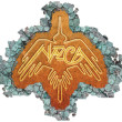
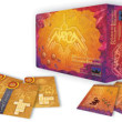
Nazca

 Nazca was a board game designed by Ben Shanks and produced by 3am Games. I worked with Ben and the 3am team to design every visual element of the game, from the board and pieces to the box itself. Unfortunately, the game turned out to be more expensive than expected to manufacture, and never went into production. The game logo, shown here, is based on the “great condor” design, one of the largest of the giant, ancient, and mysterious geoglyphs found in the Nazca Desert of Peru.NextPrevious
SBCFO


Jonathan Ankney contact us at VisibleU to build him a simple, new site for his business with a fresh branding look. His previous site focused on a deep green as both a botanical color and as the color of money; a good CFO will help your cash flow grow like a tree. The logo design is intended to imply a leaf. I created a set of versions of this simple logo for use in both print and online channels.
Go to website »NextPreviousDylan Stein Acupuncture
When Dylan asked me to create a logo for his acupuncture practice, he had originally been considering the name “White Peony Wellness,” a reference to the flower’s important role in Chinese medicine, as well as being a symbol of legend. I combined the text with a simple silhouette of a peony, and then incorporated the soft design into the header of the website I set up for him.
NextPreviousAlbum
Rotation


This is the first album from musician/composer/minister/liturgical rock star Isaac Everett. The songs cycle through the liturgical year, and features an undefinable mix of enchanting rock styles. I designed all the visuals for the album, and shot the photos for the CD cover myself.
NextPrevious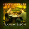
Transmission


This is liturgical rock star Isaac Everett‘s second album, with lyrics by J. Snodgrass. Subtitled “A Mass in Thirteen Songs,” Transmission continues to explore the fusion of old practices of worship and modern musical styles. I designed all the visuals for the album, and shot the photos for the CD cover.
NextPreviousGame
Nazca


 Nazca was a board game designed by Ben Shanks and produced by 3am Games. I worked with Ben and the 3am team to design every visual element of the game, from the board and pieces to the box itself. Unfortunately, the game turned out to be more expensive than expected to manufacture, and never went into production.NextPrevious
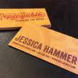
Replayable
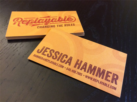
 Game designer, educator and researcher Jessica Hammer asked me to create a logo and business card design for her personal brand, Replayable. Dr. Hammer’s work involves using games and gamification to address inequalities and injustice throughout the world. I suggested the slogan “Changing the Rules” to refer to the way she has sought to level the playing field for oppressed and marginalized groups of people through games. I worked with a local printer to select the best brightly dyed cardstock and printing method to make her branding stand out from the pack.NextPrevious